Last night I worked on getting the new theme changes hacked into my trunk build. After about an hour of failed attempts, I ended up having to pull a new tree to get the patch to grudgingly apply – only to run into bug 346214 and a missing close tag introduced by the patch in browser.xul.
Overall the theme itself is nearly complete and only has a few remaining CSS and polish issues to hammer out. Barring anything catastrophic, the new theme should be landing on the 1.8 branch really soon and should be available in nightlies sometime tomorrow or over the weekend. So without further ado, may I introduce to you the latest iteration of the new official theme for Firefox 2!
Update: The theme is now available in the latest nightly builds. See the link below to grab a copy.
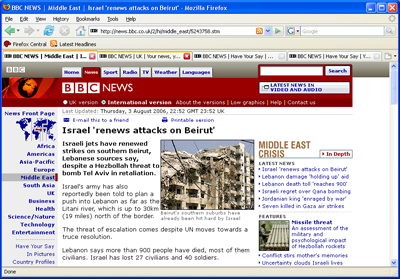
Overall look
The first tab here is active and the second is being hovered over. The last two are inactive.
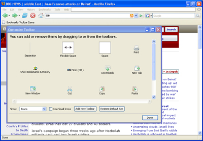
Toolbar buttons enabled and toolbar palette
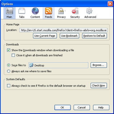
New options window
Just a little -moz-image-region funkiness here, but overall not too shabby. The icons here really show quite a bit of Mac influence (see the current pinstripe theme). And if you were wondering – yes, the privacy and security icons are flipped 😉
Tab overflow
The only thing I’m really not a fan of is the reload button and the fact that the buttons no longer have raised backgrounds while hovering over them. The new reload button goes for a motion effect underneath the arrows and ends up with what looks like two blue blobs on either end of it.
I asked around about the button effects and found that they were indeed intentional. I guess it would be a bit odd to implement the new back/forward button drop-down menus while keeping the normal button-like appearance, but then again I’m not entirely enamored by the new drop down blobs sticking out of the sides of the arrows.
Find bar
I really like the new find bar icon set. The only thing that doesn’t look so great is the new wrap icon, which looks very much like a stream of blue goo flowing over the top of an index card. The current icon ( ) does a pretty good job of making it clear what’s going on while without the text next to it, I’m not sure what the new icon would be trying to tell me.
Of course the beauty of using Firefox is that if I don’t like a particular icon or if I miss the 3D button backgrounds, I can change them without breaking a sweat. 🙂
Overall the new theme is looking great. Kudos to Michael Glenn, Michael Bodalski, Jay Goldman and anyone else on the Radiant Core team I may be forgetting. They really have done quite well in the very small window we gave them to get it done.
Update: Updated the screenshots to contain the polished off version of the search engine drop-down.
Update 2: Gavin and Mike recently checked in the changes to the win/pinstripe themes and the tinderboxen have been respun. Builds containing the changes are on their way out the door! 🙂
Update 3: Nightly builds from 2006-08-04-09-mozilla1.8 onward now contain the theme updates. You can download ’em here: ftp://ftp.mozilla.org/pub/mozilla.org/firefox/nightly/latest-mozilla1.8


Very cool thanks
I dont like it… lol joking
When Firefox was during Bon Echo Alpha development, they have this spelling check during typing, but not sure if it was just me, they have removed the spell-check service.
As for the visual theme of Firefox 2, I find that there are lots of themes around which can be used. So, I don’t find anything special about the visual refresh function.
these changes are no where near as drastic as I was expecting. I guess they want to keep firefox simple. either way, looks good to me.
ummm… isn’t this supposed to be version 2 as in not 1.6? sure looks alot like the old one. I guess I expected version 2 to look remarkably better that the drab 1.x. So I’m kind of disapointed, you’d think out of all the great themes out there, that the devs would create one that rivals the rest. Guess I’ll just end up installing the Fusion Alternative 2 skin anyway.
That style is horrable.. The old one is WAY better. It’s too complicated, but should be as simple as the old ones.
I’m with Anon. I’d expect a v2 to include, if nothing else, a visual upgrade. Not just a few new icon sets and mild change in menu items. Yes, I know I can extend it. But still.
Aha! So those funky buttons to the right of the location bar and search box are supposed to be missing a left edge! I’ve only been using the nightlies on Linux, where they don’t look so hot.
I just downloaded 2.0b2, and the first thing that leapt into my mind is “I want the old theme back”.
It might just be because it’s 50-50 between bland backgrounds and the new icons / etc, but…
Alright, the tabs DO look nice.
Sorry, but I think the new default theme for Firefox 2 is dreadful. It looks clumsy and amateurish. Thank goodness we have them extensions.