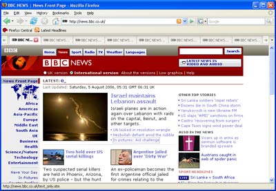
With the initial pieces of the new theme now in the hands (or at least seen by) of thousands of users, there’s no shortage of feedback. The task ahead is to separate the noise from the signal and begin assessing the many concerns, suggestions and bugs. Most of the issues users discovered today have already made their way to Bugzilla – these are just a handful of the total bugs already on file for the new theme, but they’re the issues that I’ve seen being most loudly complained about:
Note: Please refrain from adding unnecessary comments or ‘me too’s to any of these bugs. They’re all confirmed and nearly all are most likely going to be approved to block the release of 2.0. If you’ve found a bug and wish to report it, please search throughly (preferably with the advanced search page) before doing so – the majority of bugs filed usually end up as duplicates. Also note that Bugzilla is not the place to express your feelings about the new theme. If you want to discuss it, please use the newsgroup or the forums.
347398 – menu buttons for back and forward history misaligned on mac
347399 – browser toolbar icons should not have hover effect on Mac OS X
347400 – search button disconnected from search field
347401 – New refresh icon is poor at small size
347402 – Go button is attached to the search bar
347405 – go button disconnected from URL bar. URL bar too tall
347406 – “Advanced” and “Privacy” panels icons have wrong image region / “Privacy” and “Security” icons are swapped
347410 – 2.0 Theme Bug — report site toolbar icon needs more padding
347412 – “Back” and “forward” toolbarbutton layout gets broken when using Icon+Text for the navigation toolbar
347416 – Visual refresh doesn’t natively style toolbar buttons anymore
347428 – Search bar does not scale when using large fonts
347432 – Navigation dropdowns appear disconnected
347435 – Live Bookmark Icon misplaced
347447 – back and forward dropdowns look strange with new theme updates
347463 – Proxy icon (favicon) in location bar scaled badly when feed or lock icon displayed
347467 – [Mac] Abuse of gray in icons after Pinstripe visual refresh
347468 – Background tabs are too light after visual refresh
347470 – New theme icons have too much intervening horizontal space on Linux
347482 – [Mac] Pinstripe visual refresh leaves vertical lines in some tabs
347487 – [Mac] Tab title and close box shift to the right when backgrounded
Of course no discussion about the new theme would be complete without the obligatory screenshots of the latest changes, so for today I’ll leave you with a little preview of the new tab bar. It still needs a few CSS tweaks and polish, but it’s nearly ready and should show up in nightly builds in a few days.
First tab has focus, second is a hover effect over the close button and the rest are inactive

Tab overflow with new arrows and ‘all-tabs’ drop-down menu
Stay tuned for more updates as they become available! 🙂
